Blush wedding colors range from barely-there ivory pairings to dusty rose and peach, and the right match depends on whether your wedding needs color that competes with strong architecture or softens sparse spaces.
Sage green drapery with blush florals reads as neutral across lighting conditions, while terracotta and burgundy need stone or heavy brass to keep from turning theatrical.
1. Blush and Sage Green Floral Arrangement
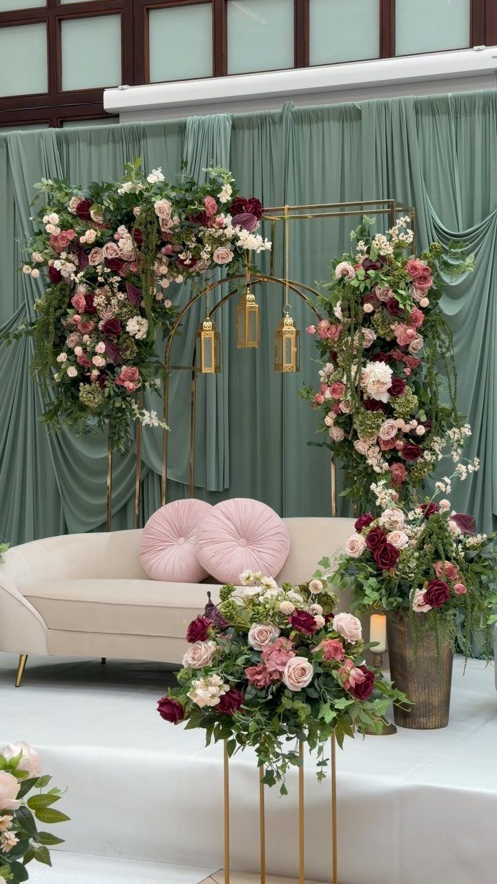
Sage green drapery with blush floral arrangements brings garden softness indoors without relying on actual outdoor conditions.
I like this pairing for couples who want color that photographs consistently across venues, since sage reads as neutral in most lighting while blush warms it.
The greenery works best as eucalyptus or trailing ivy rather than stiff structural leaves, letting it drape the way the visible arch shows. Blush roses with ivory filler blooms keep the arrangement from turning too pink against the green.
Keep the sage to linens or drapery rather than florals, where it can look muddy. The gold lanterns in the visible setup add the metallic note that separates this from a purely rustic look.

Notice:The flowers are as individual stems across four varieties; you will need to arrange them into a bouquet yourself upon receipt.

PLUS SIZE WRAP FIT: Designed in sizes S-3XL, this plus size wrap maxi dress features a feminine wrap front and long silhouette for everyday wear and special casual occasions.

12 Inch Pink and Green Balloons: The pink and green balloons include: 20* sage green balloons, 20* peach balloons, 20* ivory white balloons, 1* green ribbon
2. Blush Floral Arrangements and Navy Blue Linens
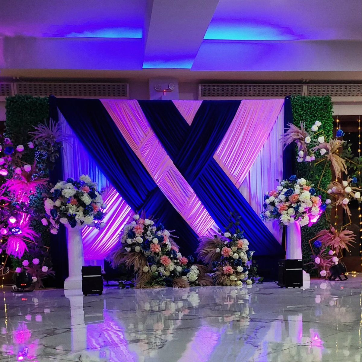
Navy blue against blush creates the kind of contrast that reads clearly across a large reception hall, where paler pairings can wash out. This suits evening weddings particularly, since navy deepens under artificial light rather than fighting it.
The visible setup uses draped fabric rather than solid walls, which matters for your budget, solid navy backdrops read flat where fabric catches light and shadow.
Blush florals on white pedestals lift the eye; ground-level arrangements alone would sink against the dark linen.
I would put the navy on tables and attire rather than ceremony backdrops, where it can dominate in photos. Blush ties on navy suits let the wedding party carry the palette without matching the decor exactly.

Blush Balloon Garland Kit: 18” retro pink/nude/metallic rose gold balloons(3 pcs), 12” retro pink/nude/metallic rose gold/confetti rose gold balloons(20 pcs), 10”retro pink/nude/white sand/metallic rose gold/metallic gold balloons(50 pcs), 5”retro pink/nude/white sand/metallic rose gold/metallic gold balloons(70 pcs) and 10 pcs balloon tools(balloon arch strips, tying tool, 100 glue points, ribbon, flower balloon clip, hook)

【Rich Pigment & Versatile Shades】Featuring an array of multi vivid shades including black, white, brown, purple, green, and beige, this pressed powder eyeshadow palette is designed for crafting stunning eye makeup looks that range from subtle to bold. Each shade is highly pigmented for impactful color that draws attention

【Vibrant Color Selection】Choose from 22 stunning shades, including 15 mattes (Snow, Gray, Spicy, Forest, Sea, Blue Sky, Dark, Buff, Coffee, Light Beige, Misty Mauve Gray, Dusty Rose Pink, Caramel Brown, Misty Taupe, Earthy Brown), 3 soft shimmers (Blue Spark, Tapestry Taupe, Cocoa Brown Shimmer ), and 4 high-shine glitter shades (Moonlight, Saturn, Glass, Champagne), perfect for daily wear, festivals, and performances.
3. Blush Roses and Burgundy Peonies
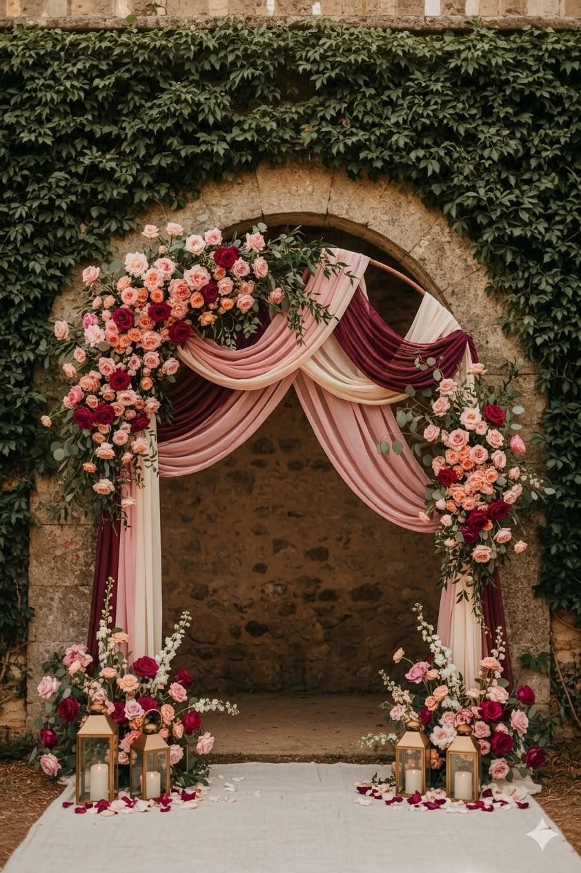
Deep burgundy peonies against blush roses give you a palette with actual range rather than variations on one note. Layer burgundy fabric behind blush blooms rather than mixing them into indistinguishable arrangements; the contrast keeps both colors readable.
This works for fall weddings where you want warmth without orange, or formal settings where pure blush reads too casual. Sage green foliage bridges the 2 pinks; without it, the contrast can look accidental rather than intentional.
Hard architecture, like stone, grounds romantic florals and keeps burgundy from feeling theatrical. If your venue lacks that element, consider wooden structures or even heavy brass candelabras to add weight.

Natural Linen-Blend Fabric: Our linen shower curtain is crafted from a mix of 20% natural linen and 80% polyester custom fabric—No pungent odors or harsh plastic friction noise, it’s gentle on skin. Its thick fabric boasts rich rural charm and natural linen texture. Comes with 12 WHITE PLASTIC HOOKS, fitting most shower rods for easy, flexible installation.

Best Choice Wedding Arch: Sheer arch drapes are good choice for your wedding decor. Romantic arch fabric will help to create beautiful folds or leave it flowing loose onto the floor, adding a very delicate, soft touch. Best wedding decoration gift.

Petal-Soft Egyptian Cotton Sateen: Our king pillow cases set of 2 are woven from 100 percent extra-long staple egyptian cotton in a lustrous sateen weave, from our 500 thread count collection. The high thread count fabric feels opulent, soft, and silky against your skin, while long, premium cotton fibres stay naturally cooling and breathable while sleeping — a real help for hot sleepers prone to night sweats.
4. Blush Roses and Lavender Flowers
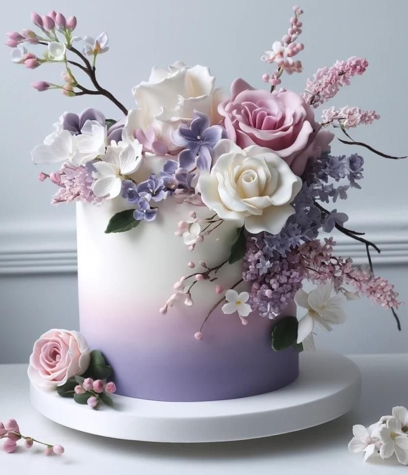
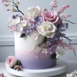
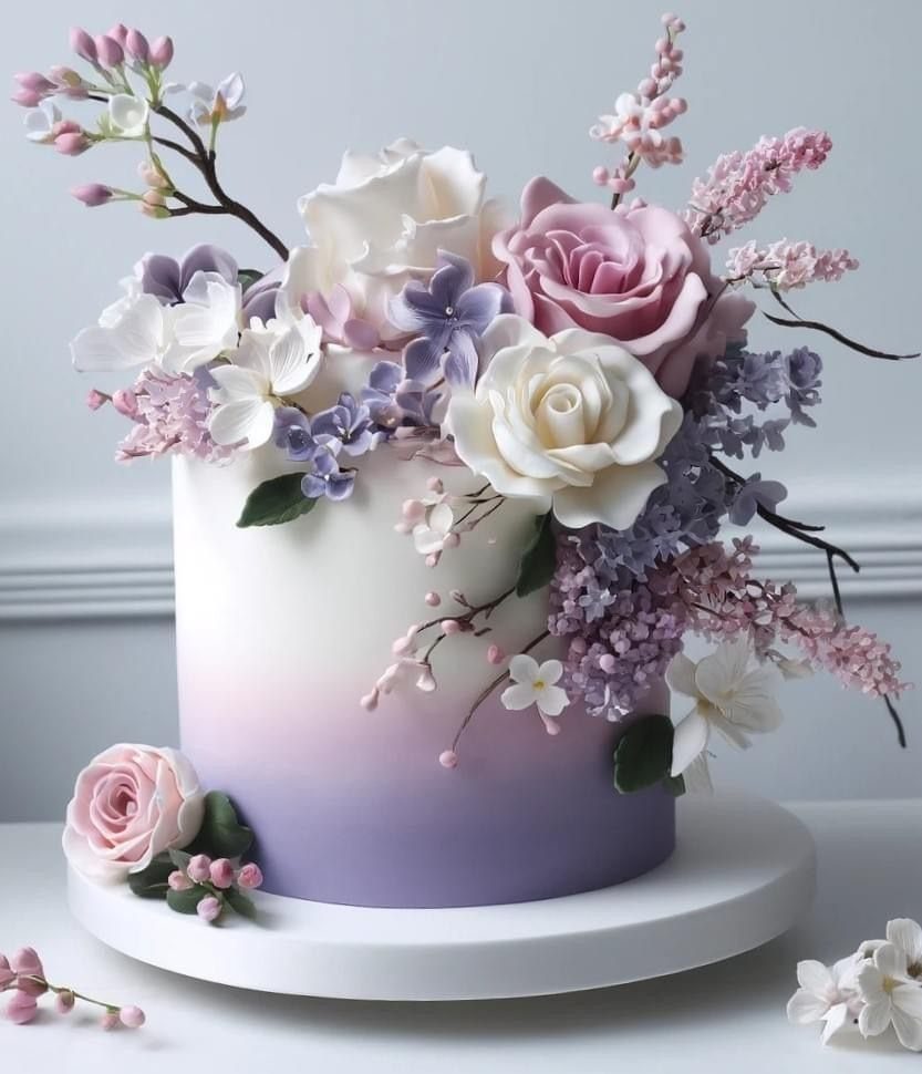
Blush roses with lavender flowers build a palette that moves between warm and cool rather than committing fully to either.
The visible cake shows this in sugar work, lavender blossoms as accents rather than dominant color, which is how to handle it in real florals too.
Lilac and lavender read as distinctly purple in large doses, which can clash with warm skin tones in bridal party photos. Keep lavender to smaller blooms, sprigs, or chair ties while blush carries the arrangement weight.
I would check that my florist’s lavender is fresh rather than dried, dried lavender grays quickly and loses the soft quality that makes this pairing work.
Chiffon bridesmaid dresses in either blush or lavender let you test the balance before committing the whole reception.

❤️ Floral Set: This set features a diverse mix of handcrafted flowers, including various types and colors of faux silk and foam blossoms, as well as greenery. Ideal for bridal and bridesmaid bouquets, floral arrangements, table centerpieces, and more.

❤️ What You Get: The package includes 80 mixed faux flower heads in various sizes and styles (approx. 0.8"–3.6" in diameter), perfect for all your crafting projects. The ample quantity ensures you'll have enough for your creative needs.

Burgundy Roses Artificial Flowers Set: A combo box packs a variety of flowers as a winter, autumn, fall season themed wedding. A total of 18 fall fake flowers and 10 accessories, including mixed silk and foam terracotta roses artificial flowers with stems
5. Blush and Ivory
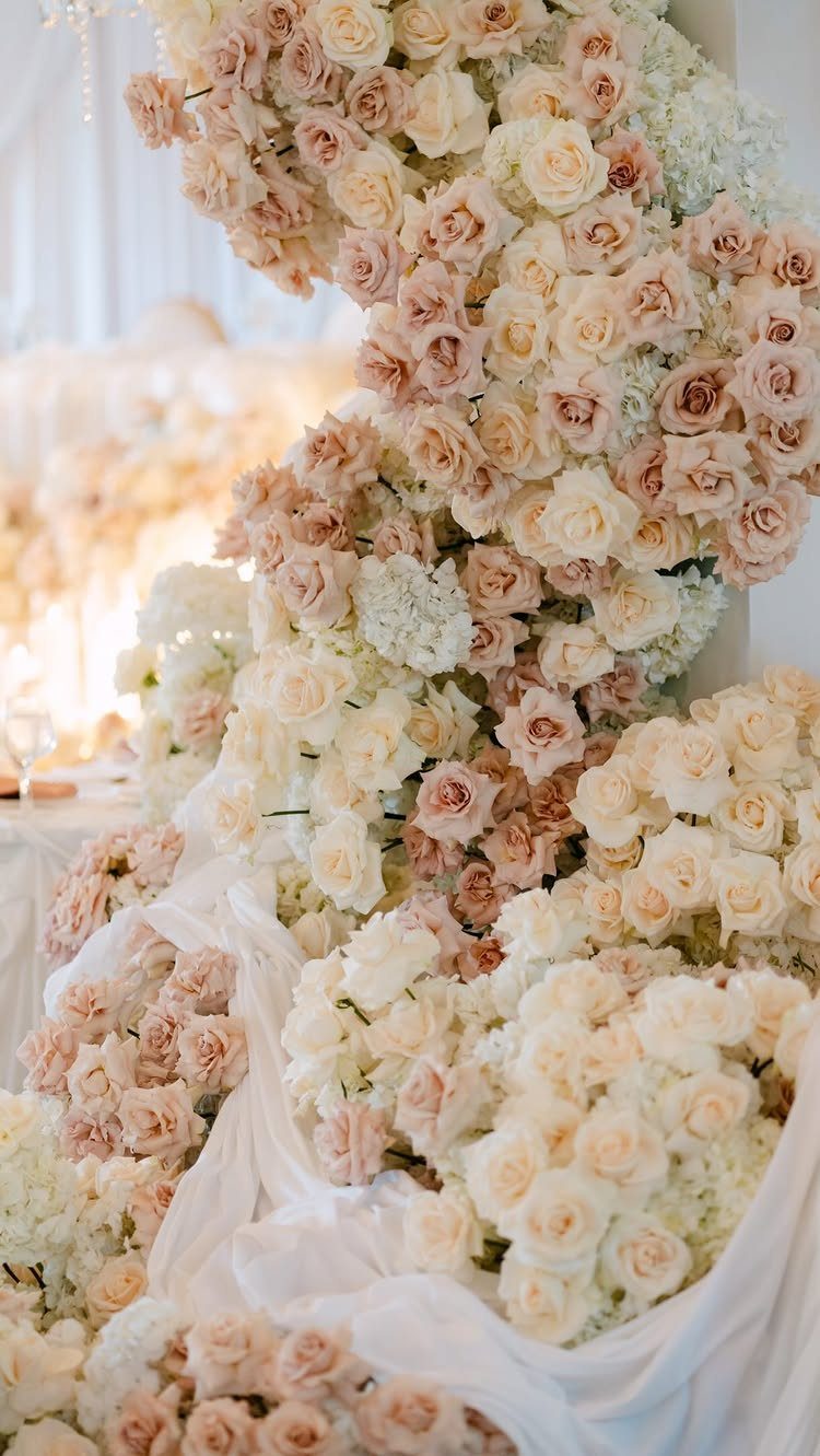
Blush and ivory together create the softest possible palette, which means your materials have to carry the interest since color contrast will not.
This suits formal weddings where restraint itself reads as elegance, and venues with strong architectural detail that does not need competing color. Without that structure, the look can flatten into generically pretty.
Ivory here is not white; the difference matters in photos where true white can make blush look dirty by comparison.
Test your linens and florals together in daylight before ordering; champagne beige gives slightly more warmth than pure ivory if you need it.
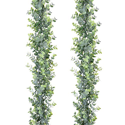
Quantity:2 Pack Faux eucalyptus garland , Each pack with 134 Pcs large fake eucalyptus leaves, total 268 Pcs Eucalyptus Leaves,This eucalyptus garland has many branches,Looks very realistic and Three-dimensional.

NATURAL LOOKING DECOR: This artificial eucalyptus garland uses a blend of green and silver leaves to mimic the look of eucalyptus vines hanging in a natural setting.

Quantity:6 Pack Faux eucalyptus garland , Each pack with 134 Pcs large fake eucalyptus leaves, total 268 Pcs Eucalyptus Leaves,This eucalyptus garland has many branches,Looks very realistic and Three-dimensional.
6. Blush and Terracotta
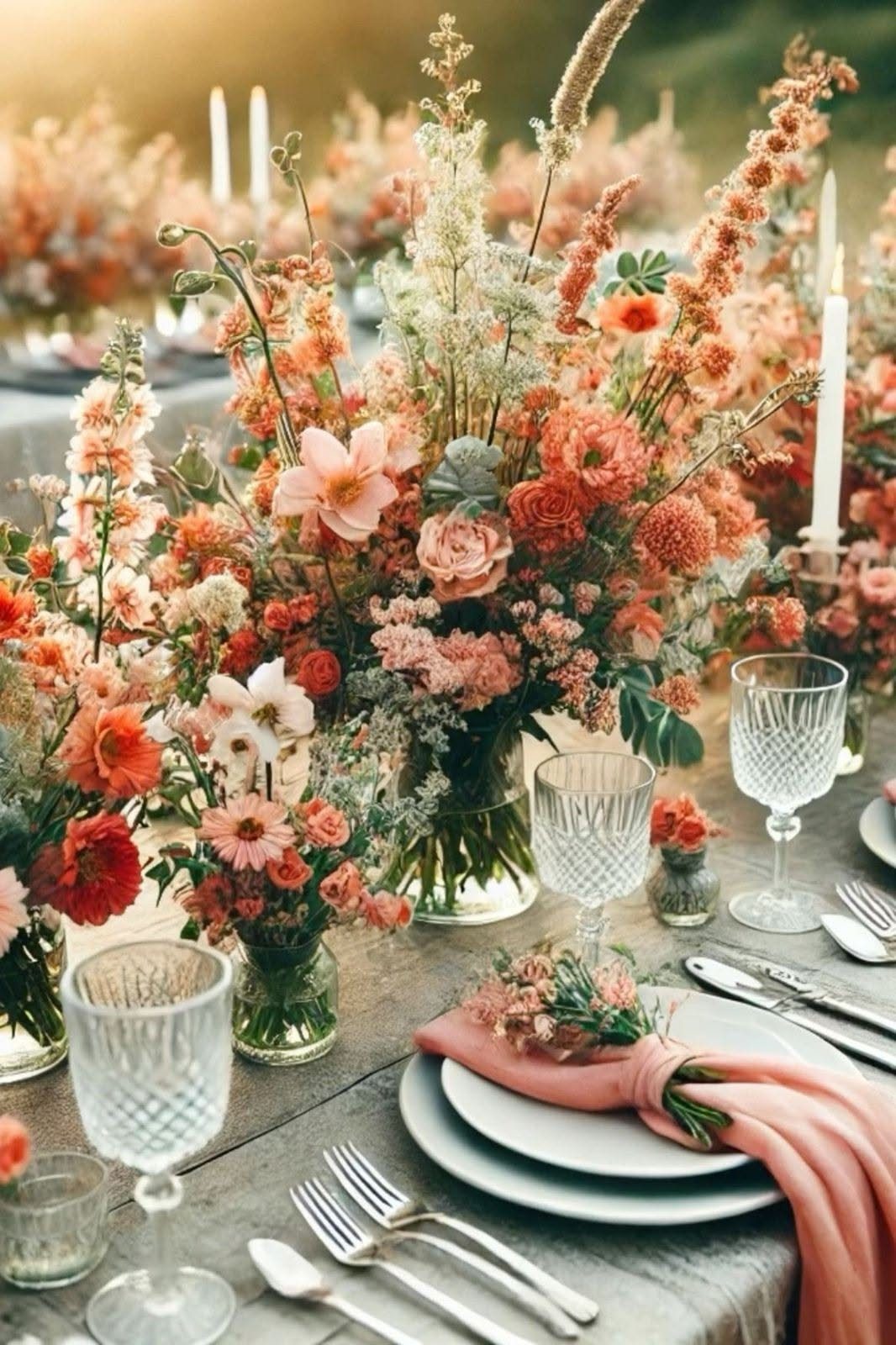
Warm terracotta with blush brings in earth tones that keep the pink from feeling too sweet or too bridal-shower conventional.
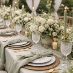
The visible table shows this in practice, terracotta dominates the florals while blush appears in the napkin, a small touch that ties the palette to the wedding party.
This combination suits outdoor settings or rustic venues with wood surfaces, as the photo’s table demonstrates. Dried florals extend the season, working from late summer through early fall when fresh choices narrow.
Taper candles in warm white rather than stark white continue the glow; the tall ones visible add vertical interest that balances the low, spreading arrangements.
I would keep metal accents to brass or gold rather than silver, which cools the whole table against what you are building.

Flattering A-line Dress: Summer wedding guest dresses for women 2026 have fitted bodice with flowy skirt. Stretchy mesh fabric hugs curves comfortably and makes this fit flare boho sundress feel completely free, just effortless comfort

Girls Party Dress: Elegant sleeveless V neck pleated ruffle tulle tutu dress floor length wedding flower girl dress ball prom maxi gown,is made of soft, breathable material , offer a pleasant wearing experience. girls flowy tulle long maxi dress is perfect for princess birthday dress, pageant dress, tea party dress, junior bridesmaids dress, first communion dress, father daughter dance dress, homecoming dress for girls, your little girl will look fabulous in it and will get so many compliments.

【3-Roll Chiffon Ribbon Set】This chiffon ribbon set includes 3 coordinated rolls in Blush Pink, Sage Green, and Ivory, with each roll measuring 1.5 inch wide and 10 yards long, providing 30 yards in total. Made from soft, lightweight chiffon with a delicate silk-like feel, these chiffon ribbon rolls offer a beautifully coordinated color palette for wedding invitations, bouquet wrapping, gift packaging, floral styling, bow making, and handmade craft projects.
7. Blush and Peach
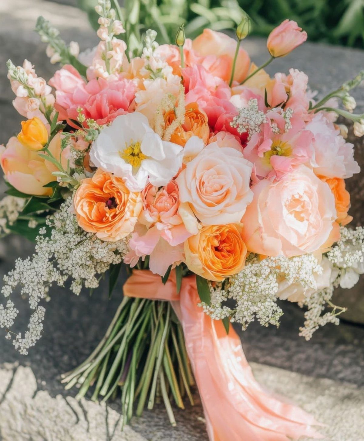
Peach carries enough warmth to make blush register as color rather than accident, which is where this pairing earns its place. Spring and summer weddings suit it best, when the light is high enough to keep both tones from muddying.
The ribbon on the visible bouquet shows how to tie the 2 colors together physically, not just visually.
I would carry peach into the bridesmaid dresses while keeping blush dominant in florals, so the palette moves rather than matches. Orange accents, like the visible blooms, need restraint; one or two stems per arrangement, not a theme.
Fresh peach roses hold their color better than blush in outdoor heat, a practical reason to flip the balance for an outdoor ceremony.

Neutral Nude + Rose Pink Color Story: Inspired by the most loved cool nude and rose-toned makeup trends, this 12-color eyeshadow palette combines taupe browns, dusty pinks, champagne shimmer and smokey shades for everyday natural glam and soft romantic eye looks.

1️⃣ Romantic Rose Nude Everyday Color Story This 5 color matte eyeshadow palette features dusty rose, mauve pink, cocoa brown and neutral nude tones designed for effortless daily makeup, soft glam looks, date makeup and office wear. Perfect for natural beauty lovers.

9 Rose-Toned Matte and Shimmer Shades — Pink nude, soft brown and rosy matte tones pair with rose-gold, silver and deep black accents, giving you the range to create subtle daytime eyes, luminous soft glam or a deeper pink-brown smoky look in one coordinated palette.
8. Blush and Dusty Rose Floral Arrangements
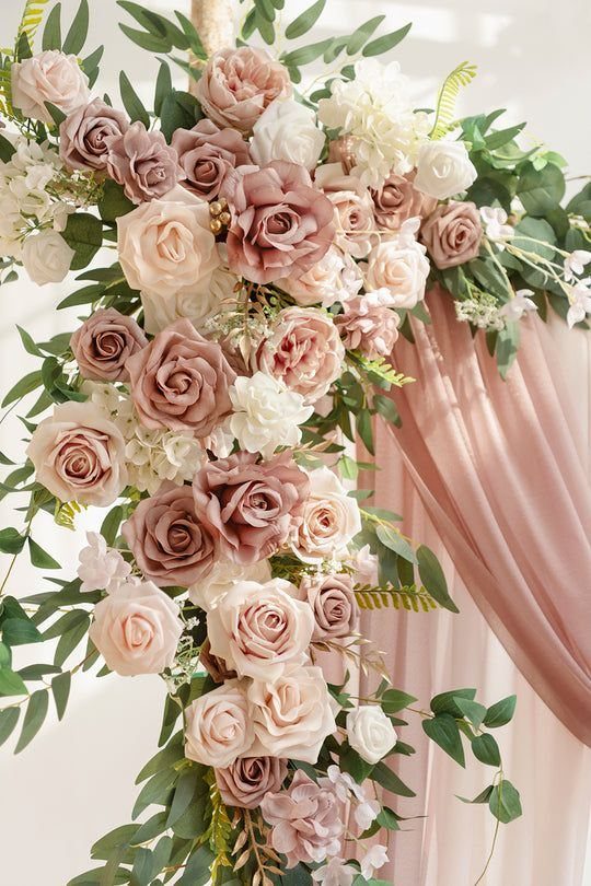
Blush and dusty rose together risk collapsing into one pink smear unless you keep their textures and values distinct. The arch handles this by separating dusty rose to fabric and blush to blooms, though the flowers themselves carry both tones.
Greenery is what keeps the two pinks from flattening; without it, even skilled florists struggle to make the eye read two colors.
Matte fabric absorbs light while the roses reflect it, and that contrast is what keeps the two pinks from flattening into one.
White in candles or accent blooms gives the eye a resting place so the pinks do not overwhelm. Sage tablecloths, where the season suits them, drop the temperature just enough to keep romantic from sliding into saccharine.

Wedding Arch Drapes Material: These drapery fabric panels are made of an unique fabric that has a slight shimmer, they are silky soft and more graceful than tulle or nylon...
9. Blush and Champagne
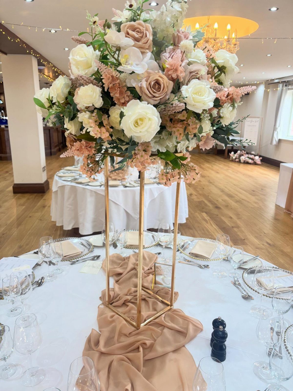
Champagne fabric against blush florals reads as wealth because the materials themselves, silk, velvet, heavy linen, carry the cost rather than demanding extra ornament.
One tall metal stand carries the gold; scatter it everywhere and the effect becomes competitive rather than calm.
The runner’s tone matters more than its width.
Too pale and it disappears into white linens; too deep and it competes with the blush. Rose quartz and warm ivory are neighboring values, a good test for holding fabric swatches against your floral samples before ordering.
Taper candles in warm white continue the glow without adding another color.
I would skip wax seals and ribbon details on stationery unless they are genuinely done by hand; at this level of finish, obvious machine work undercuts the palette’s purpose.

WEDDING BRIDESMAID BOUQUET - Handmade silk blush & burgundy roses bouquets are good size, classic and elegant, perfect for wedding bridesmaid bouquets, 4 floral bouquets are enough for wedding bridesmaids.

A set of pre-made dusty pink, burgundy and white bridesmaid bouquets for wedding. 11 inches in diameter. Perfect for bridesmaid on wedding or even just nice decoration for your home.

Approx. size of bouquet: 10*10*11 inches (L x W x H). This bouquet is perfect for the rustic wedding ceremony
Decor Elements
Blush works as a thread when it appears in materials that guests actually touch and see in sequence.
Linens set the tone first, then floral arrangements on those same tables, then the wedding party moving through the space, then the paper left behind at each seat.
Stationery is where most couples drop the thread; a blush envelope liner or wax seal on the place card costs little and reminds guests of the palette at the moment they are seated.
Silk ribbon on programs or menus carries the color without demanding custom printing.
Pearl-embellished heels on the bride or bridesmaids do the same work as jewelry, visible in seated moments and processionals. Gold-accented table settings need restraint; one metallic element per place setting keeps the look intentional rather than accumulated.

Artfully Crafted: Organic textured eucalyptus leaves with cozy lights along the eucalyptus vine add a special and appealing addition to wedding backdrops, arch, table centerpieces decor

🎉Size&Package🎉:Each artificial eucalyptus garland is appr. 7 Ft in length with 96pcs eucalyptus leaves.Package includes 8 pack garland,total 98 Ft/768pcs leaves

PACKAGE & SIZE: The package includes 3 pack artificial eucalyptus garlands in around 5.6 feet length each. Each leaves garland contains 134 fake eucalyptus leaves, a total of 402 fake eucalyptus leaves. They can be twisted together to look denser.
Blush Color Variations
The difference between soft pink, rose quartz, and dusty rose is value, not just hue.
Soft pink carries the most white and reads youngest; rose quartz has a faint cool undertone that shifts toward gray; dusty rose sits darkest and leans brown.
Used together, they need physical separation, one on fabric, one on flowers, one on paper, or the eye cannot hold them apart.
Champagne beige and muted taupe act as bridges rather than main colors.
They let you shift from blush toward warm neutrals without the jolt of ivory or true white. Warm ivory sits between them, useful when you need a light tone that does not fight the pink family.
Test swatches in 3 lights: morning window, midday shade, and your venue’s evening bulbs. A rose quartz that reads soft in daylight can turn lavender under LED.
Floral Pairings
Roses and peonies carry blush reliably because their petal structure diffuses light rather than reflecting it flat.
The flowers you pair with blush matter less than their scale and placement.
Large peony heads need room to open; tight arrangements bruise them. Small blush roses in bunches read as texture rather than individual blooms, useful for table garlands where guests see them from above.
Dusty rose and rust-colored blooms shift the tone toward terracotta and away from sweetness, which some couples want and others do not.
Seasonal Trends
Spring blush leans into new growth; sage green and cream whites keep it from feeling like a nursery palette.
The light is high and cool, so blush needs enough saturation to survive it. Summer heat pushes blush toward peach or terracotta as fresh choices narrow and the color itself warms in golden-hour photography.
Fall pairs blush with burgundy because the deeper tone borrows from turning leaves without surrendering to orange. The combination needs hard architecture or heavy metal to ground it; in a tent or soft venue it can feel theatrical.
Winter blush is the least common choice, and the most dependent on material richness, velvet, silk, candle glow, to keep it from reading as cold.
Blush works in every season because it is fundamentally a skin-tone color, adapted to the light that falls on actual faces. The seasonal variation is in what surrounds it, not in the color itself.
Frequently Asked Questions
What are some good blush colors for a wedding?
Blush pairs well with sage green, navy blue, burgundy, lavender, ivory, terracotta, peach, dusty rose, and champagne.
Sage green table linens and draped fabric hold their color better than sage in flower arrangements, where the tone tends to go dull and brown.
Navy blue tuxedos and bridesmaid dresses gain richness under string lights and ballroom fixtures instead of looking flat or off.
What are the best color combinations for a wedding?
Blush pink and navy blue stay readable from the back row of a big banquet hall; lighter pairings disappear at that distance.
Blush paired with burgundy gives you 2 distinct temperatures, warm pink against cool dark red, instead of stacking similar shades.
Blush and champagne look expensive because the fabrics do the work: silk catches light, velvet adds depth, heavy linen holds its shape without extra trim.
What are the 2026 wedding color trends?
Soft blush tones combined with earthy colors like terracotta and sage are trending.
Hot summer weather is pushing 2026 brides toward peach and terracotta blush tones as the fresher options start to feel overused. Fall weddings are pairing blush with burgundy, taking the idea from autumn leaves but stopping short of full orange overload.