The 6 ideas below run from paper to petals, suits to cake, and the right one depends on whether your venue already has heavy wood or brick that will pull the color toward autumn no matter the season.
Gold foil on cream paper keeps an invitation formal, but that same gold against velvet reads evening; the difference is the ground you put the orange on, not the orange itself.
1. Burnt Orange Wedding Invitations
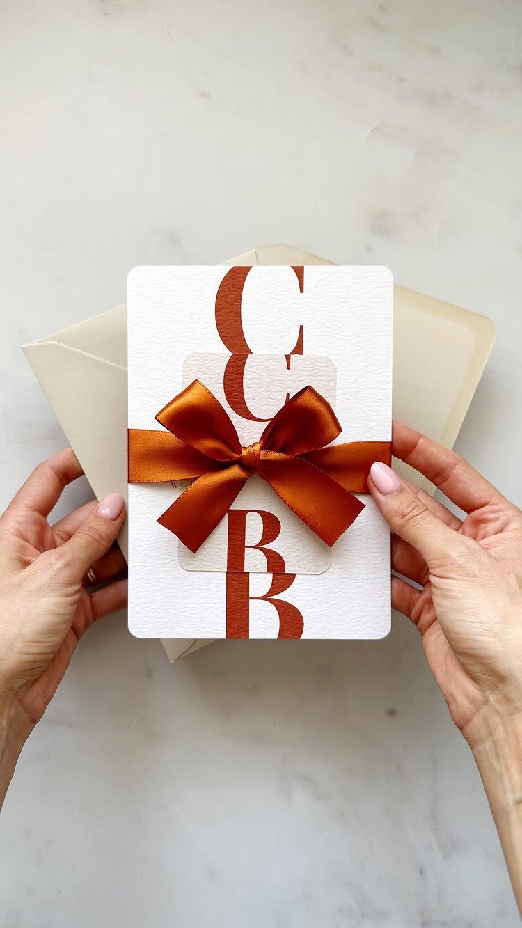
A burnt orange invitation suite tells guests exactly what kind of wedding to expect before they even open the envelope.
For my own taste, I would keep the paper white or cream and let the color come through in the ribbon, the envelope liner, or the lettering itself; printing on orange paper can work, but it takes a heavier stock and good design to avoid looking like a Halloween flyer.
Gold foil adds a formal weight that suits evening weddings, while kraft paper leans into the rustic side that burnt orange already wants to go.
Match the formality of the wording to the formality of the design; a mismatch there is the first thing guests notice.

💌 Color: A7 Burnt Orange Envelopes, 120gsm good quality paper.

🥂【Package included】20 * Terracotta Laser Cut Invitations POCKETS + 20 * White Envelopes+ 20* Gold Seals
2. Burnt Orange Wedding Table Setting
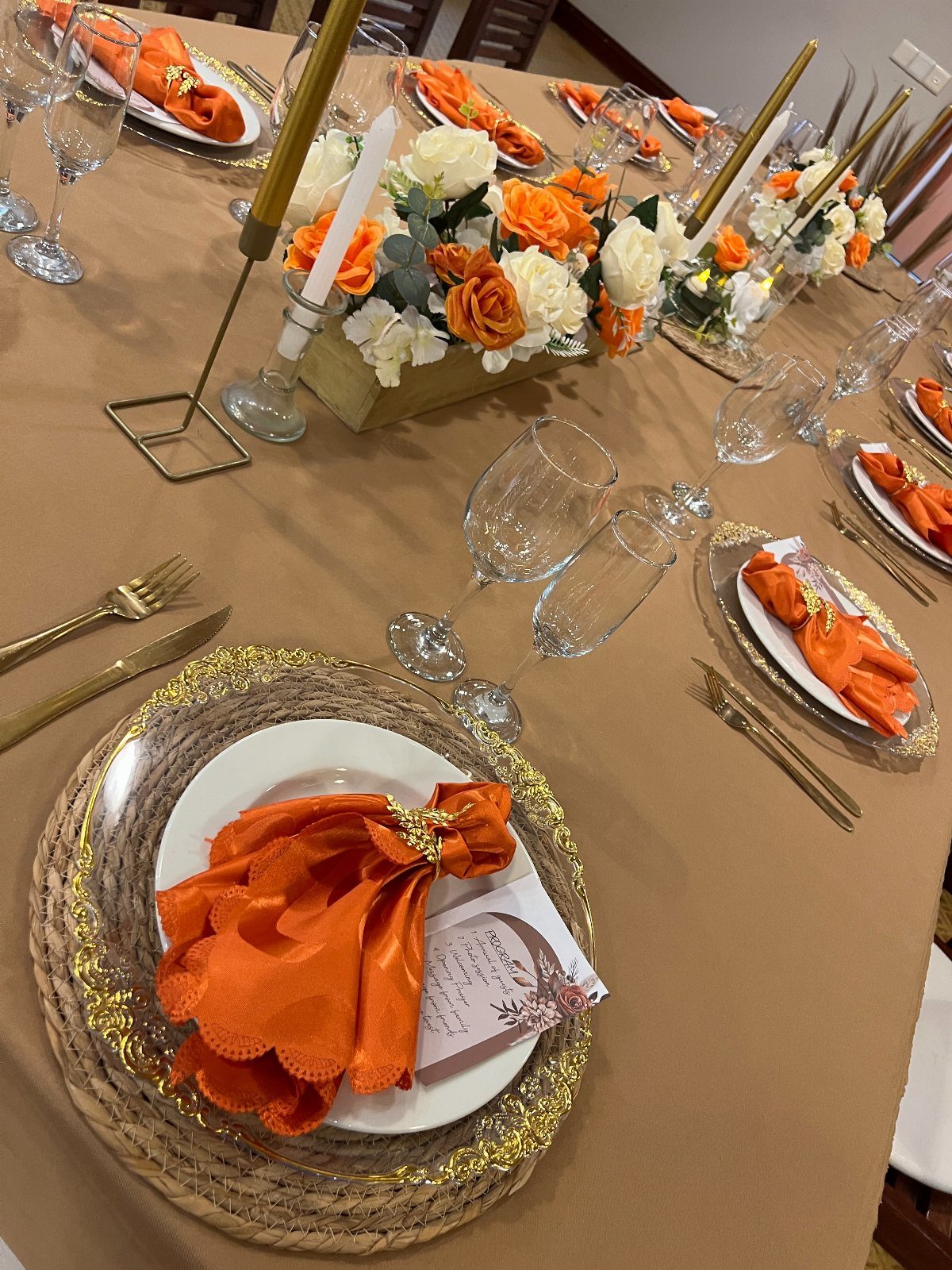
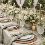
Build warmth through layers: a woven texture underneath, then a bright napkin as the single strong color note against white plates and gold hardware.
That restraint is worth copying. Burnt orange spreads fast across a whole room, so decide early whether you want one hit per table or a fuller wash through drapery and signage.
The visible setup keeps the orange to napkins and flowers, which means you can change your mind late if the rentals do not come through.

[Package content] -50 x satin jacquard napkins; Dimensions: 17 x 17 inches/43 x 43 centimeters; Each cloth napkin can be folded into different shapes for placement, which can add a decorative touch to your dining table during parties and make it more aesthetically pleasing.

❤What You Can Get: Each package contains 100 pieces of burnt orange satin napkins 17 x 17 inch, which are suitable to decorate a table accommodating 12 - 16 diners. Adequate quantity for home daily use or party used. These satin dinner napkins will make your table sparkle brightly and beautifully.

FANCY SATIN NAPKINS: Square Burnt Orange Napkins are crafted from 100% polyester satin fiber, with soft feeling in hand, smooth and delicate. Shiny satin dinner napkins with neat edges, which can be folded into various shapes with good plasticity.
3. Bridesmaid Dresses in Burnt Orange
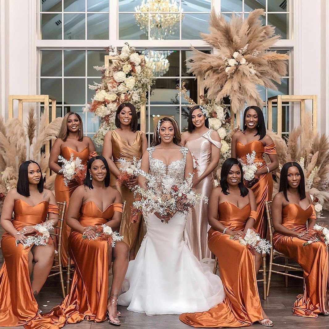
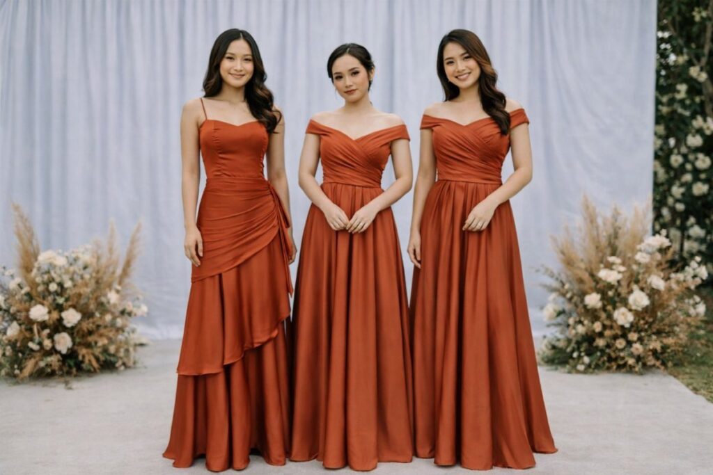
For a softer, more forgiving look, chiffon or silk moves differently and photographs matte.
I would put my own bridesmaids in whichever fabric flattered the widest range of body types, since burnt orange itself is bold enough without adding shine that someone might feel exposed by.
Gold or bronze jewelry harmonizes without competing; silver reads cooler and can clash against the warmth of this particular orange.

ONE SIZE: fits all US 0-16;PLUS SIZE: fits all US 18-24

Features: Burnt Orange One Shoulder Bridesmaid Dresses with Slit for Women,Burnt Orange Silk Satin Bridesmaid Dresses with Pockets for Women,Mermaid Pleated Bridesmaid Dresses with Split for Women,Modest Off Shoulder Bridesmaid Dresses Long for Women,Elegant One Shoulder Mermaid Formal Evening Gowns with Pockets for Wedding Guest features Built-In Bra,One Shoulder,Mermaid,Pleated,Empire Waist,with slit,Floor Length.

Fabric has slight stretch
4. Burnt Orange Wedding Cake
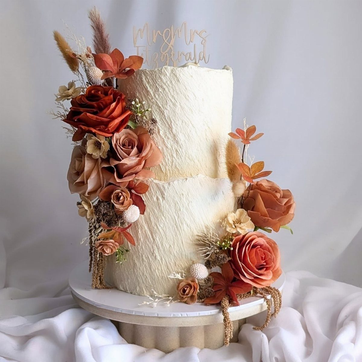
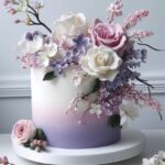
Textured white cake with burnt orange flowers lets you have the color without committing an entire tier to it, which is the safer choice for a crowd that might flinch at orange frosting.
The visible roses look like sugar work, but fresh flowers in muted orange and terracotta tones achieve almost the same effect for less money and no fondant struggle at home.
Metallic gold leaf or painted accents raise the formality; deep green foliage or ribbon brings in the complementary color that makes the orange feel intentional rather than accidental.
Spice flavors like carrot or pumpkin pair naturally with the visual theme if you are already doing a fall wedding.

Elegant Floral Design: the wedding cake topper features 3 pieces crafted silk flowers mainly in burnt orange; These flowers for cake decorating are designed to enhance the aesthetic appeal of your wedding cake that complements your overall wedding theme; Note: Cake flower decorations can be placed directly on the cream, or inserted into the cake with the help of auxiliary tools (such as wire), without the need for auxiliary pasting, you can DIY as much as you want

❤️ Floral Set: This set features a diverse mix of handcrafted flowers, including various types and colors of silk and foam blossoms, as well as greenery. Ideal for bridal and bridesmaid bouquets, floral arrangements, table centerpieces, and more.

Burnt Orange Cake Flowers Set: You will receive 3pcs cake decorations made of orange, white, red silk flowers and foam flowers. Each individual cake flower is approximately 10 inches long and 4.7 inches wide.
5. Burnt Orange Wedding Suits
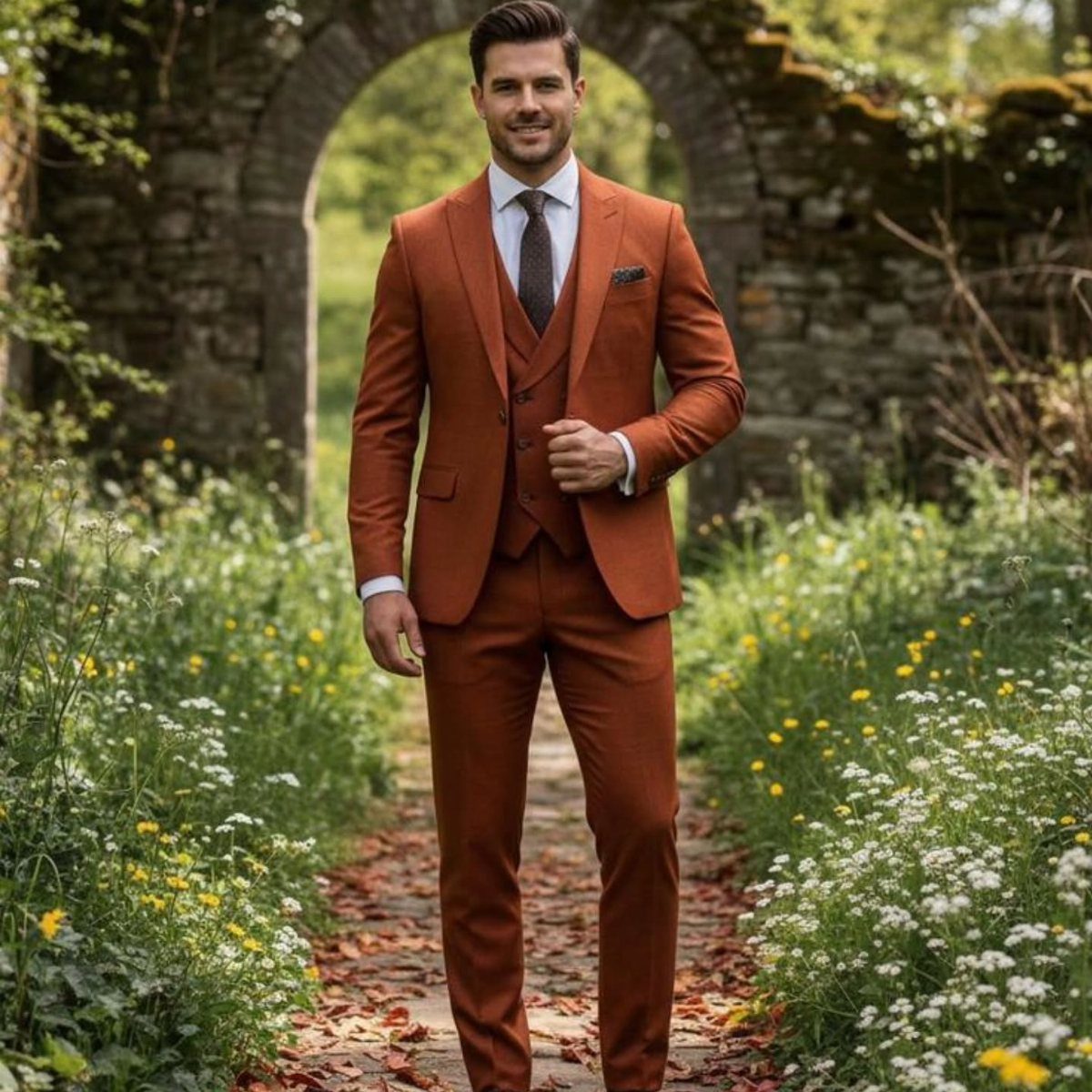
For groomsmen, I would consider making the groom the only one in the full orange and putting the party in neutral suits with burnt orange ties or pocket squares, unless the group can all carry the statement equally.
Earth tones like olive, beige, or dark brown keep the palette grounded and seasonal; a black tie against this orange reads harsh and dated.

【Burnt Orange Rose Petals】: These burnt orange rose petals are made of premium satin fabric, soft and comfortable to the touch, the edges of the petals are slightly curved for a realistic look. Artificial rose petal is perfect substitute to real roses, will never wilt and can be reusable

Size and Material: This Garisey handcrafted rose flower garland is 5 feet long and made of high-quality foam and silk.The rose leaves have a real texture.

Burnt Orange Wedding Table Centerpieces - A stunning combination of different shades of orange roses, dandelion, dahlia & lush greenery leaves. Enjoy that wonderful feeling that beautiful flowers give you in your big day.
6. Burnt Orange Wedding Bouquets
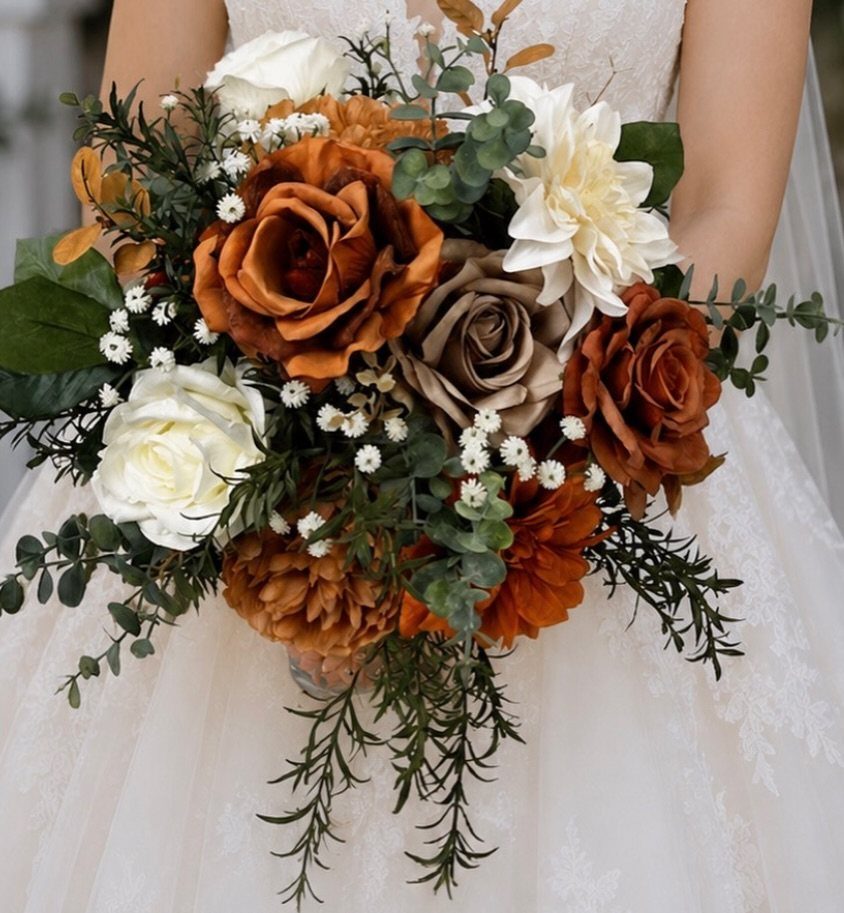
Eucalyptus gives the trailing greenery that photographs well against lace, and the dried elements add texture that fresh flowers alone cannot match.
Ranunculus and protea are harder to source out of season, so ask your florist about availability by your date before falling in love with a specific flower list.
Dried wheat or pampas grass extend the bouquet’s life through the day without wilting, which matters more than you think for a long wedding with many photos.

Material : 120 GSM /80lbs thick and great Texture Paper
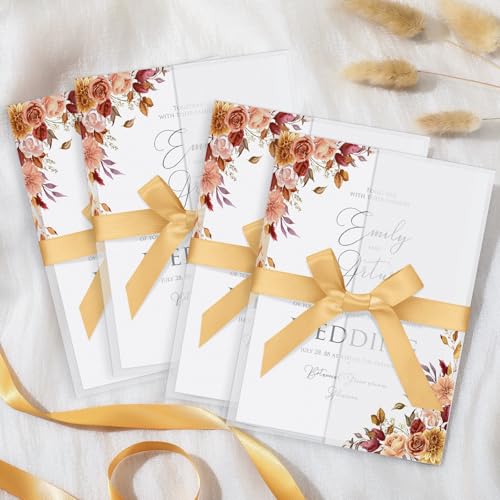
Wedding Invitation Accessories: the package includes 100 pink wedding pre folded vellum jackets for 5x7 invitations and 100 ribbons, which are made of quality 130GSM kraft paper, at the same time, the edges are chamfered to avoid scratches on your hands during batch processing; Please note that our products do not come with cards, the cards in the pictures are for display purposes only

·Standard Size for Everyone: Suitable for all, each invitation card measures 4x6 inches, providing a perfect fit for various occasions.
Complementary Colors for Burnt Orange
Deep burgundy, soft peach, and gold build a palette that reads sophisticated rather than seasonal. I would use burgundy where I wanted weight: table linens or a velvet ribbon on the bouquet.
Peach works best as the relief color, the one that lets burnt orange sit forward without shouting. Gold reads evening; brass or antique gold keeps it from tipping into prom territory if your wedding is earlier in the day.
Cream, ivory, beige, and brown also pair with burnt orange, though they pull the whole look toward rustic rather than formal.
The choice between those two directions is the first one to make, since it determines whether you reach for linen and ceramic or velvet and foil.

Premium Quality Fabric: These napkins are made of delicate satin, silky soft and glossy texture, not easy to fade, not easy to shrink, can be folded into any style; and they are colorfast, wrinkle-free, which have the exquisite workmanship, and the seams on the edges are very delicate and neat. The beautiful dinner napkins will decorate your your table top and light up the party!

SMOOTH SATIN NAPKINS: Satin cloth napkins are made of high-quality 100 percent polyester (satin fabric). Silky satin napkins has a smooth touch with charming and shiny colors, you can fold out various shapes according to your ideas. Machine washable, reusable, not easy to wrinkle and fade.
❤What You Can Get: Each package contains 100 pieces of burnt orange satin napkins 20" x 20", which are suitable to decorate a table accommodating 12 - 16 diners. Adequate quantity for home daily use or party used. These satin dinner napkins will make your table sparkle brightly and beautifully.
Using Burnt Orange Year-round
Burnt orange does not belong to fall alone.
For a spring wedding, I would use it as the accent against a lighter ground: white or blush as the dominant color, with orange appearing in the invitation envelope liner, the napkin fold, or a single flower variety in each arrangement.
The same warmth that feels like harvest in October reads like late afternoon sun in May.
Summer allows a brighter, more saturated orange.
Pair it with pink or green in floral choices rather than the deeper burgundies that suit cooler months. Keeping the surrounding colors light enough stops the orange from dragging the whole room toward autumn.
If your venue has heavy wood or brick already, burnt orange will lean seasonal no matter the date; balance it with white flowers, pale linens, or glass and metal surfaces that reflect light back.

Feature:The square neck bridesmaid dress long formal gowns features short sleeves,satin,pleated,ruffles,slit,empire waist,a line,with pockets,lace up back.The pleated decorates your waistline perfect.This square neck slit dress is very elegant and charming.And the comfortably satin assures you wearing this dress comfortably in every season.

Material: Spaghetti straps bridesmaid dresses 2026 are made of soft lining and satin. Lightweight and breathable. This formal dress brings you an elegant and glamorous look

Feature:Off Shoulder,V Neck,Silk Satin,Ruched,Pleated,with Slit,V Neck Bridesmaid Dresses,Satin Formal Dresses,V Neck Satin Formal Dresses for Women,lace up,ruched,chiffon,corset back,floor-length,plus size,a line.simple design let your looks elegant and charming. perfect for beach wedding dresses.