Royal blue runs through this list from the bridesmaid dresses that frame the ceremony to the table settings, linens, and the cake itself, with stops at invitations, complementary colors, and how the shade shifts by season.
What decides which idea fits is how much of your budget can go toward statement linens and metallics versus how much you want the color to carry through flowers and fabric alone.
The four-tier fondant cake with gold initials, at the high end, sits only a few sections away from the single blue tier that achieves the same effect for less.
1. Royal Blue Bridesmaid Dresses
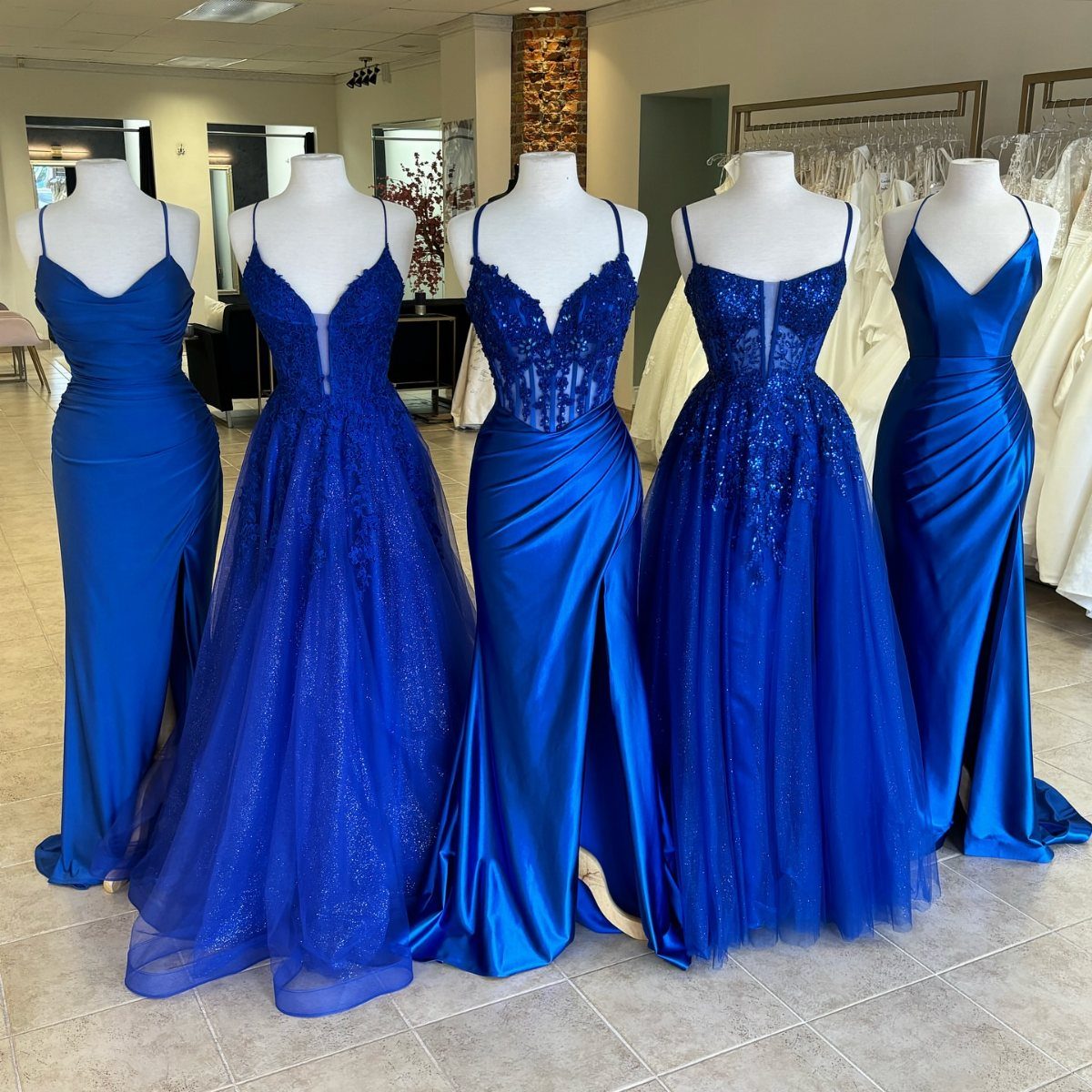
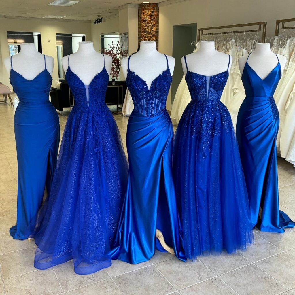
Bridesmaid dresses in royal blue carry the color where guests will notice it most, against skin tones and in motion down the aisle. I like this approach because it commits fully without asking the couple to redesign the whole room.
The shade reads formal on its own, so the dresses need little added jewelry.
Pair them with white bouquets, or with green for something I saw work well at a spring wedding, though that shifts the palette toward a cooler overall feel.
Bouquets with blue flowers echo the dresses directly; white ones let the blue stand alone as the single strong color.
Mixing necklines keeps each bridesmaid comfortable while the color still reads as one group; halter, long sleeve, or whatever each person prefers works fine.

Polyester/Spandex,Fabric is Elasticity,Stretchy,Comfortable

ONE SIZE: fits all US 0-16; PLUS SIZE: fits all US 18-24

Premium Design: Butterfly short sleeves, double V-Neck, empire waist, sexy V-Back design, floor-length, and anti-see-through lining make you look more elegant, charming and beautiful at any important moments.
2. Royal Blue Linens and Gold Chargers
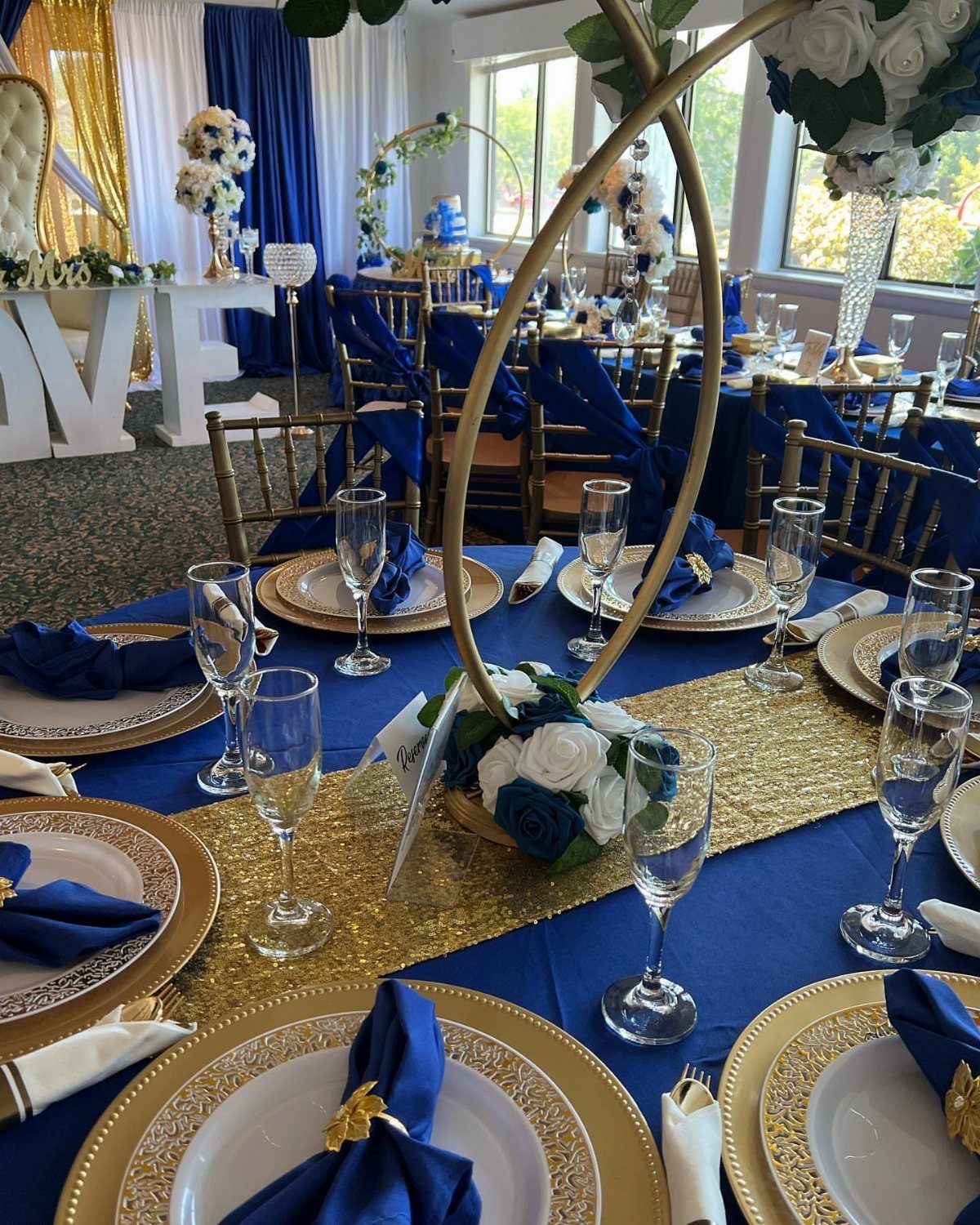
A sequined gold runner across a royal blue tablecloth catches light the way flat fabric cannot, and the chargers underneath each plate give every guest their own small frame of shine.
This pairing asks for confidence with glitter. I would keep the sequins to the runner alone; full sequin cloths fight the eye across a whole room.
Gold vases for centerpieces continue the metal upward, and gold flatware, if the rental budget allows, completes the link between plate and flower. Blue napkins folded simply, not competing with the runner, keep the table from feeling overworked.
The look suits evening receptions where candles will bounce off both surfaces.

Mesmerizing Regal Appearance: four Royal Blue Mesh Table Runners, featuring a lightweight blue tulle base densely covered with wavy gold sequins; Ideal for rectangular round tables, runner comfortably accommodate 8 to 10 guests, add a touch of royal charm

Package Include: Each royal blue sequin table runner measures 12" x 72" in size, total 10 pieces, which is appropriate for rectangle or round tables that can seat 4-6 people.

❤ WHAT YOU GET : 1pc 36x36-Inch square royal blue sequin table cloth
3. Royal Blue and Silver Tableware
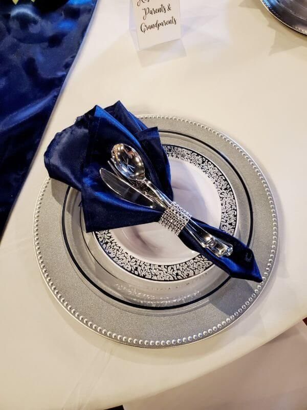
Silver reads cooler and more modern than gold against the same blue, and a beaded charger under each place setting gives texture without demanding additional centerpieces.
The satin napkin with a rhinestone ring, visible in one place setting, costs more per guest than standard folded linen but replaces the need for a separate favor or place card.
I would test the ring’s closure in person; some slide loose during a long dinner.
Patterned china on top of the charger adds another layer, though rental warehouses vary widely in what patterns they stock, so this look requires early shopping.
Silver flatware and blue floral arrangements continue the tone across the table without adding new colors.

PACKAGING: You will get gold placemats set of 100, gold glitter thin round placemats in the diameter of 13 inch. gold foil table placemats can meet your various dining table decoration needs

Proper Size: Package includes 12 pieces gold charger plates with a 13 inch diameter (and 6.7 inch indentation). These charger plates fit under salad plates, soup bowls, and main course dinner plates to prevent your table from spills and messes, maintaining a clean dining environment while adding a sophisticated touch

Include 12 pack gold round charger plates. The outer ring measures 13" D and the inner ring measures 9" D. Great decorative charger plate that makes a stunning focal point for any place setting.
4. Royal Blue Floral Arrangements
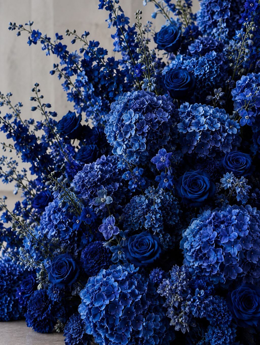
A full arrangement in one color, built from roses, hydrangeas, and larkspur, proves that royal blue can carry a whole bouquet without needing white filler to soften it.
Hydrangeas give volume cheaply per stem but wilt fast in heat; I would plan these for indoor tables or late-day outdoor events.
Larkspur adds height and a looser shape than roses alone, though its season runs shorter, roughly May through August depending on region. The monochromatic approach asks for varied texture, since color alone will not provide contrast.
For aisle arrangements or altar pieces, this density reads dramatic. For guest tables, I might scale down or alternate with greener pieces to rest the eye.

Package:150pcs blue napkin rings, your best choice for big events ,small banquet and family dinner, durable and SAVE YOUR MONEY!

ELEGANT DESIGN – Add a touch of elegance to your wedding or special event with napkin rings. Create a beautiful tabletop display with diamond design napkin rings.

·Table Napkin Set: You will receive soft 20 pcs 17 x 17 inch (43cm x 43cm) satin napkins and 20 pcs gold napkin rings. Enough to meet your daily needs, ideal for family gatherings parties and various holiday celebrations.
5. Royal Blue Table Settings
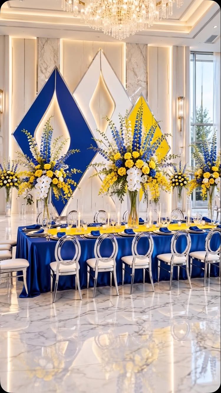
A single long table in royal blue with a yellow runner and blue napkins makes a bold statement that works best when the room itself is neutral, letting the linen become the decor.
Gold cutlery, noted in the background material, warms the combination where silver would turn it cooler and more graphic. I have seen this pairing read sports-team if the yellow leans too primary; a mustard or antique gold keeps it wedding-appropriate.
Tall centerpieces in both colors continue the line down the table but block cross-table conversation, so this suits a bridal party table or a display piece rather than every guest’s view.
A geometric backdrop behind the head table gives the eye somewhere to land in photos without paying for more floral.

HEAVY-DUTY CONSTRUCTION: Features extra-thick, 20% thicker than standard blue disposable plates, made of food-grade blue and silver plastic to resist bending and leaking.

PREMIUM QUALITY: Made of 100% high-quality blue plastic plates, these disposable plastic plates are non-toxic and built to last. The sturdy blue plate set resists bending or breaking during use, ensuring a reliable dining experience. Please note this blue plate set is not suitable for microwave or dishwasher use.

Bulk Plastic Disposable Dinnerware: you will get 100 blue plastic plates, including 50 10.2'' dinner plates and 50 7.5'' salad plates, 50 silver knives, 50 silver forks, 50 silver spoons and 50 blue rim plastic cups, the large quantity and comprehensive combination are enough for a party of 50 guests
6. Royal Blue Wedding Cake
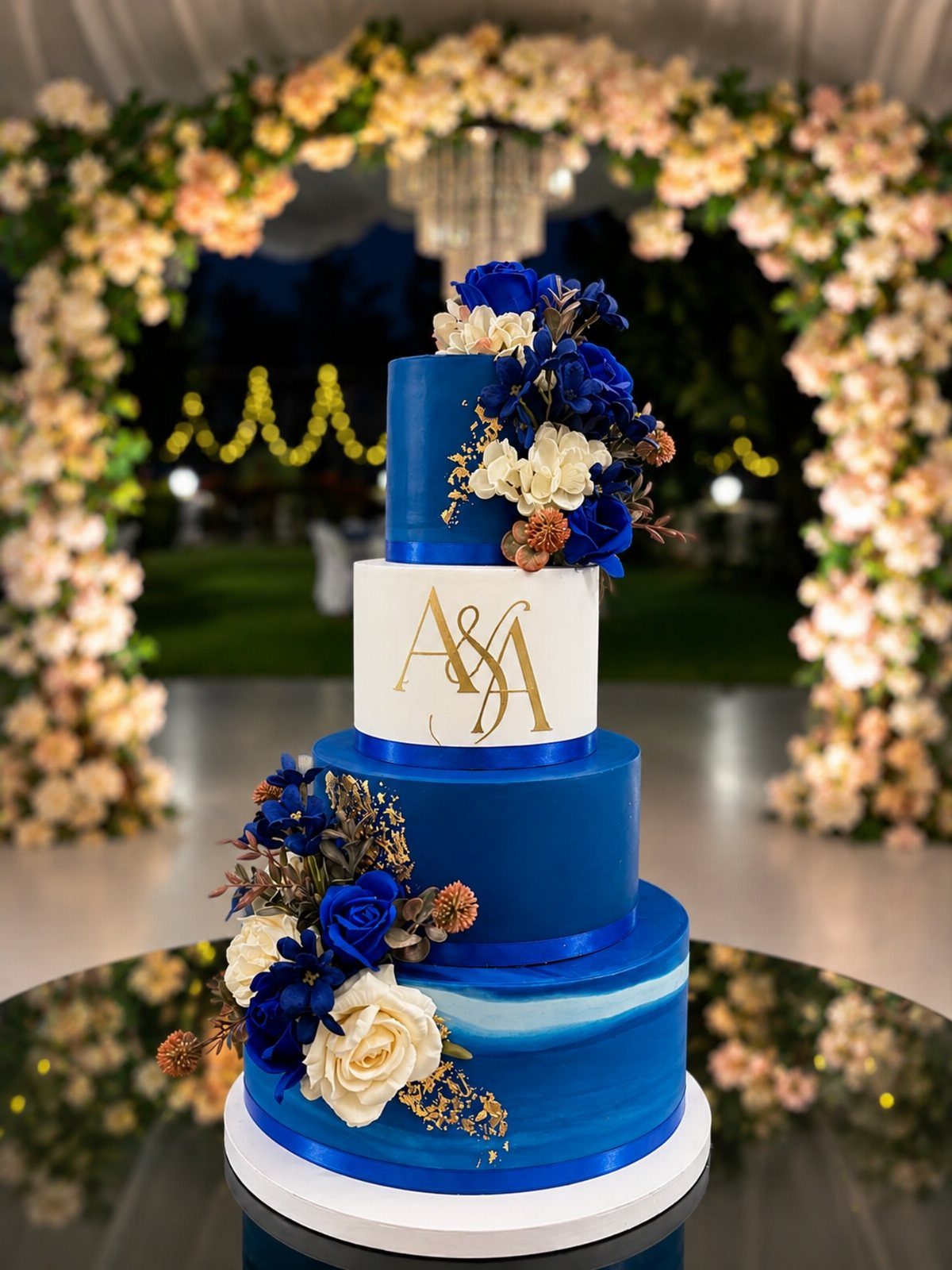
A four-tier cake in royal blue fondant with white tiers and gold initials becomes the room’s exclamation point without needing surrounding flowers at every level.
Blue fondant tastes no different but photographs deeper than buttercream in the same color, which can read lavender under some lights.
The floral accents visible here, small and placed rather than cascading, keep the shape architectural. Gold monogramming adds personalization that reads formal; I would confirm the initials with both families before ordering, since last-name changes vary.
For a smaller budget, a single blue tier among white ones carries the idea without the full commitment. Royal blue keeps its saturation outside, where lighter blues can turn gray in full sun.

ELEGANT ONE-SHOULDER DESIGN: Features a sophisticated asymmetric one-shoulder neckline with a draped off-shoulder strap that adds a touch of timeless glamour.

The Womens Formal Dress adopts high quality chiffon fabric, soft and breathable, which will offer you first-class comfort. This solid color cute dress is made of comfy and stretchy material, and the lining color is the same as the outer fabric. Classic and vintage lace style makes this semi formal dress suitable for cocktail dress, graduation dress, mother of the bride dresses, beach dresses, prom dresses for teens, casual dresses and various parties.

Built-In Pockets: Convenient side pockets to keep small essentials close at hand.
7. Royal Blue Linens and Purple Floral Arrangements
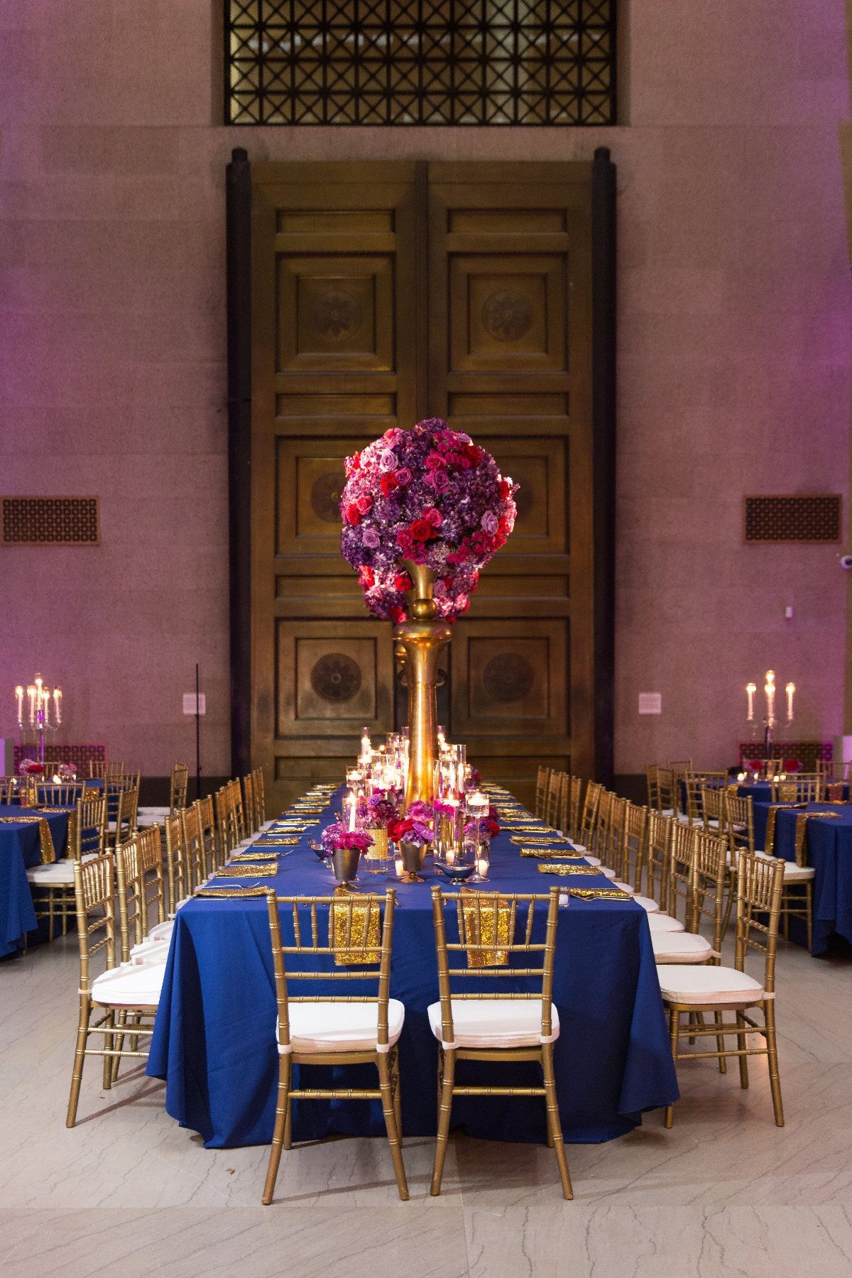
Royal blue linens against purple flowers let two saturated colors share space without either one backing down. The gold chairs and candlesticks in the visible setup warm both shades, which keeps the combination from turning cold or theatrical.
I would keep the purple in the floral range, not the linen; violet tablecloths against blue ones split the room instead of unifying it.
Bridesmaid dresses in indigo, noted as an option, let the wedding party carry the same two-color story.
The trade is that this palette asks for confidence with color. A neutral venue, white or cream walls and bare floors, gives it room to work without competing against patterned carpet or busy wallpaper.
Late afternoon into evening, when candlelight flattens the difference between blue and purple slightly, suits this pairing best.

Quantity: 1 Table Runner Material: Sequin on Mesh Base Color: Royal Blue Gold Style: Sparkly Wave Pattern Size: 12"W x 108"L Sequin Size: 18mm Edges: Hemmed Seamless 1pc Design

Royal Blue Sequin Tablecloth Size: 50" wide x 80" long. Image dimensions are for reference only, please choose the size according to your needs.

Table Runner: 1pc 12x72-inch royal blue sequin table runner. This rectangle table cover can fit a 6ft rectangular table or round table well. This sparkly table cover is great for event table decorations.
8. Royal Blue and Rose Gold
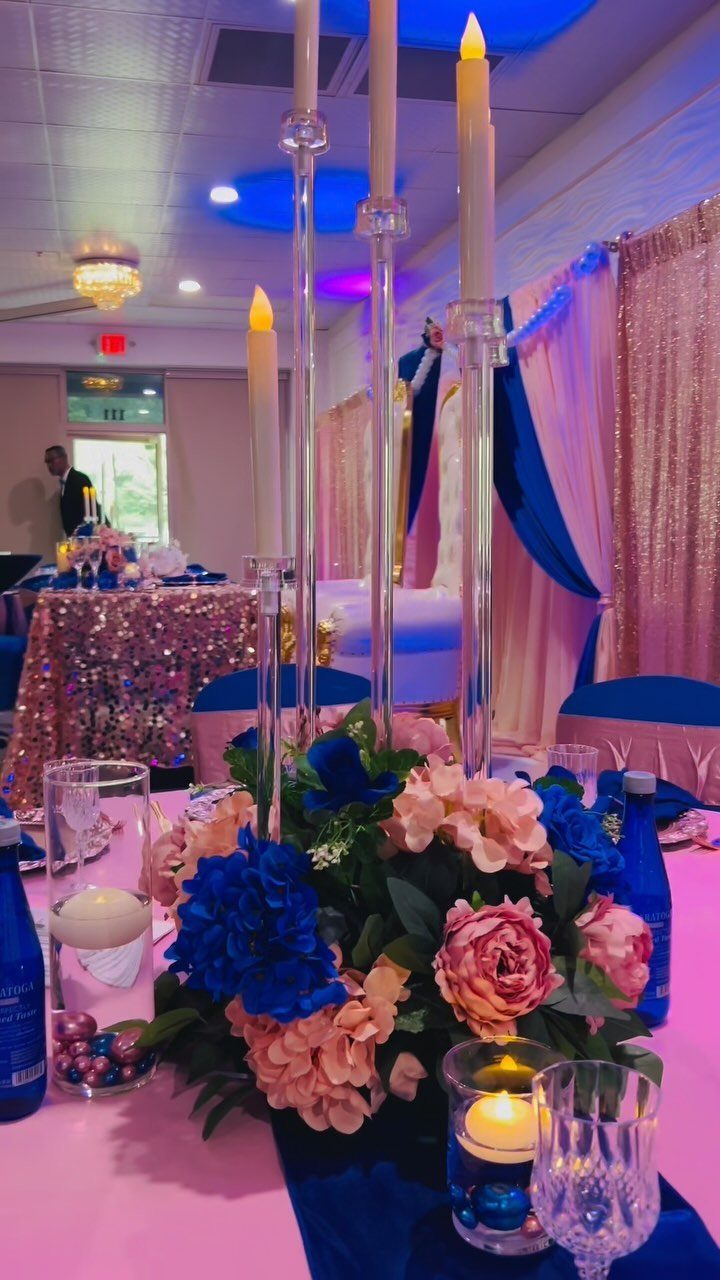
Rose gold sequins read warmer than yellow gold against the same blue, and the blush tones in the flowers soften what could otherwise be a hard contrast.
The throne chairs visible in the background signal the intended tone: this is decoration that knows it is decoration.
The sequined cloth photographs with texture that flat fabric loses, though it catches on rings and rough nails during dinner service. I would order extra napkins or place a smoother overlay where guests eat.
Tall candelabras add height without blocking faces the way full floral would, and the blue hydrangeas hold their color under indoor lighting better than lighter blues that gray out.
This combination costs more than simpler palettes; the linens and the metallics both run premium at rental houses. It suits couples who want the reception to feel like an event rather than a dinner party.

Ample Supply: Enjoy 12 elegant clear charger plates, perfect for daily use, special events, or replacements. Their minimalist yet sophisticated design elevates any occasion effortlessly

TURN EVERY MEAL INTO A VISUAL FEAST: Featuring a high-precision lamination process, the surface is as smooth and lustrous as silk satin. When light sweeps across, it produces a soft and sophisticated sheen, as if casting a natural filter over the table, elevating even ordinary tableware to a luxurious appearance.

Value Package - Set of 12 gold charger plates, 13" in diameter and able to fit 10" and 12" dinner plates, go well with salad plates, soup bowls, and main course dinner plates.
9. Royal Blue Invitations
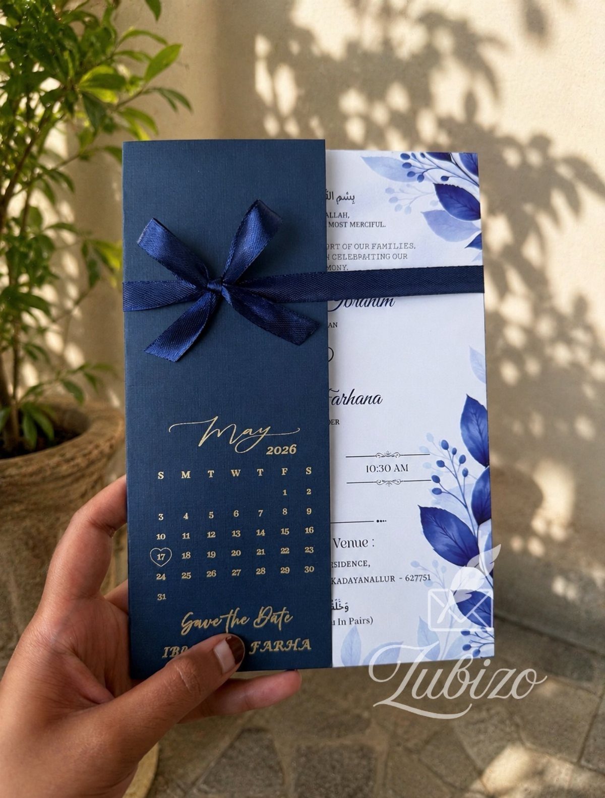
A dark invitation with a ribbon tie gives guests the first physical object from the wedding, and the weight of it sets expectations before they reach the wording.
The satin ribbon in the visible example lies flat and ties neatly; grosgrain or organza read more casual, which may suit the event but shifts the tone.
Gold lettering on dark stock needs sufficient weight to stay legible; I would request a proof held at arm’s length under daylight and under yellow bulb, since registration halls and kitchen tables differ.
The botanical pattern visible inside continues the blue into detail work without demanding the whole card carry the color.
These should reach guests with enough lead for travel planning, especially when people are flying or driving in from elsewhere.
The ribbon adds per-piece labor, so this style costs more than flat single-card invitations. A save-the-date in the same palette, sent earlier, spreads the expense across 2 mailings.

❤What You Can Get: Each package includes 16 pieces of satin napkins 17" x 17" in royal blue color, which are suitable to decorate a table accommodating 12 - 16 diners. Adequate quantity for home daily use or party used. These satin dinner napkins will make your table sparkle brightly and beautifully.

❤Product Material: This satin napkin is made of ultra smooth and soft satin fabric, and multiple colors can perfectly match many important occasions and parties.

Smooth Satin Napkins: Satin cloth napkins are made of high-quality 100 percent polyester (satin fabric). Silky satin napkins has a smooth touch with charming and shiny colors, you can fold out various shapes according to your ideas. Machine washable, reusable, not easy to wrinkle and fade.
Complementary Colors
Royal blue with cream and gold reads warmer than the same blue with stark white, and the cream keeps skin tones from washing out in photos.
Gold metallic leaves and pearl accents add texture without adding new colors; the pearls give a matte break between 2 shinier surfaces.
Champagne gold, lighter than true gold, sits closer to cream and makes the transition softer across a bouquet or table runner.
I would test cream against your specific blue before committing. Cream with a yellow undertone turns muddy next to blue with purple in it, while a cooler cream works.
The metallic gold in this pairing does the formal lifting, so the cream can be a fabric or ribbon rather than a painted element that needs precise matching.

You will receive 25 pieces of 9-inch navy blue paper plates,25 pieces of 9-ounce navy blue cups,25 pieces of navy blue napkins,1 piece of table cover,and 25 forks, in a total,sufficient quantity and various kinds can well satisfy your party needs and use.

【HIGH QUALITY】Our blue plastic plates are made of high-quality heavy-duty plastic materials, which can resist the bending of silver plates, ensuring your dining experience. The production process attaches great importance to quality, which makes our silver plastic plates more secure than ordinary plates
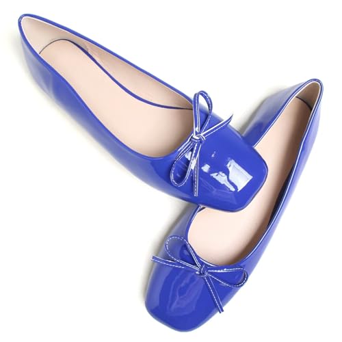
[MANY COLOR CHOICES]: - These ballet flats for women have two kinds of upper material: Patent Leather and Matte. And there are many nice fashion colors, which are great for formal and casual occasions.
Seasonal Themes
Royal blue carries differently by season because of what surrounds it.
In spring, blue bridesmaid dresses against new green grass read crisp; in summer, the same dresses against dry lawns or beach sand turn heavier. White lace and satin bows, noted in spring setups, lighten the effect with texture variation.
For fall, sapphire-toned glassware and deeper blue fabrics pick up the stone’s association with September without limiting the wedding to that month.
Winter receptions gain from blue’s natural depth under indoor lighting, though I would add warmth through candlelight or metallics so the room does not feel cold.
The seasonal flexibility means the color works, but the supporting details should shift: lighter fabrics and open shoes in warm months, heavier satins and covered shoulders when temperatures drop.
Decor Tips
Blue satin dresses and blue table linens without something else in between can flatten into a single mass; white floral bouquets or clear glassware create the needed separation.
Blue gemstone earrings on the bride or bridesmaids repeat the color small and personal, where a blue necklace competes with the dress neckline.
Ribbons on cake tiers, rather than full blue fondant, let you control the exact shade match without committing the whole dessert.
I would check the blue under your venue’s actual bulbs; satin reads lighter under warm light and can shift several tones.
Wedding Trends
Royal blue with charcoal gray suits, noted in current party setups, gives the bridal party a two-tone formality that reads more modern than black.
Navy ink on cream paper with a thin gold border carries the same palette into invitations and menus without cramming royal blue into fine print, where that saturated tone goes muddy and hard to read.
The pairing with soft pastels, mentioned alongside metallics, works when the pastel is limited to one element: blush in the bouquet, or a pale runner, not both.
Pastel and metallic together split the eye unless one dominates. Gray as a neutral for groomsmen lets royal blue stay the single strong color, which suits couples who want formality without the darkness of an all-navy party.
Frequently Asked Questions
What wedding colors complement royal blue?
Gold, silver, and cream are the pairings I would start with. Gold warms the blue and carries formality through metallic leaves, chargers, and flatware.
Cream softens the contrast for skin tones in photos better than stark white, though I would test your specific cream against your specific blue first since undertones can turn muddy.
What are the best color combinations for a wedding?
For royal blue specifically, the combinations that hold up are gold and cream for warmth, silver for a cooler modern read, and charcoal gray for bridal party formality.
The pairing with soft pastels works only when the pastel is limited to one element; blush in the bouquet or a pale runner, not both, since pastel and metallic together split the eye unless one dominates.
What are the wedding color themes for 2026?
The direction I am seeing pairs royal blue with metallics and soft pastels, though I would limit the pastel to a single element so the palette does not fracture.